When we saw San Diego on Andrew Bird's spring tour schedule, we inquired about asking him some questions regarding his music, but ended up being introduced to a wonderful Chicago artist that we hadn't yet heard of. Since Andrew has been in overload with his new record and tour, his publicist had the great idea of referring us to Diana Sudyka, who illustrated the deluxe edition of Noble Beast. We went to her site and became instant fans of her poster work and beautifully intricate nature studies. Since the visual presentation of a record often plays into our overall perception of the music, we were delighted that Diana was kind enough to provide us insight into the visual process that plays an intregal, but less commonly highlighted side of record-making.
What was the conceptual process for the Andrew Bird record packaging?
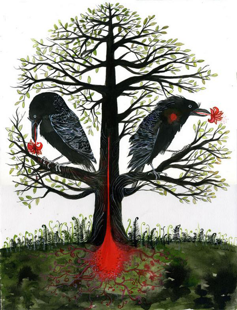
Andrew came to visit me at the Chicago Field Museum of Natural History. I have been volunteering there for a couple years in the zoology department doing taxidermy on bird specimens. He had been working on the current album, and there were some natural history themes and imagery surfacing in some of the songs. He was particularly interested in the idea of microcosms; the world of organisms that you see when you look at the underside of a log or stone(mosses, lichens, beetles etc.), or through a microscope. We looked at some of the museum's bird collections, toured the lab space, and the dermestid beetle room which is this room that has all these glass tanks full of dermestid beetle colonies that are used to clean skeletons. We discussed recurring forces and cycles in nature, such as growth and decay, water flowing over a waterfall, bird migration etc. Of course there are other themes that thread the songs on the album, but this was our main starting and connection point. The sort of overall gestalt of the album art is that of the natural world and its micro and macrocosms, and then within that we addressed making the rest of the art for each individual song.
How collaborative was it and how did it compare to your usual process for art-making?
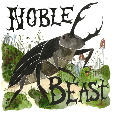
Andrew had some specific ideas that he wanted to get across visually, but within that, he gave me a lot of room. It was very collaborative, and I was able to bring some ideas to the table. It felt pretty close to the way I usually work as I got to create paintings of things that I was genuinely interested in: natural history, birds, lichens.
What is your connection to birds and wildlife and how did your Audubon-esque realm of work come to be?
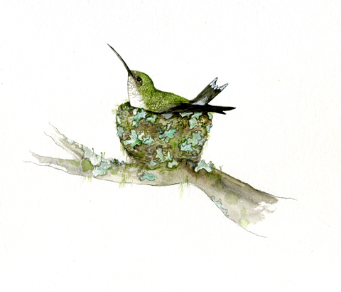
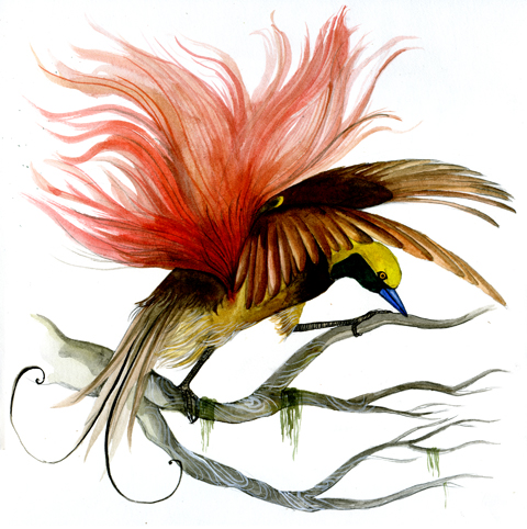
I've always had a strong interest in and connection to nature. I spent a lot of time outdoors growing up, and love to go hiking and back country camping. When I was pretty young my Aunt gave me a Roger Tory Peterson Bird Guide, and so that began the bird obsession. We had an old set of encyclopedias from my grandparents, and I would always love to look at the the color plates of birds, mammals, sea creatures, fungi, insects etc. I would draw pictures of birds and make my own bird guides. When I began volunteering at the Field Museum, I began a blog, The Tiny Aviary, that documents the work I do there and the watercolor paintings that I make of many of the birds I work on. The watercolors started out as pretty quick sketches, and now they have evolved into more developed paintings. I have been studying more closely the work of natural history artists such as: Audubon, Louis Agassiz Fuertes, C.F. Tunnicliffe. I just saw the work of a contemporary painter, Walton Ford, that deals with natural history and work of the aforementioned illustrators, and was blown away. Something to strive for, I guess.
How do you shape your everyday life around being able to make art? Why is it important to you?
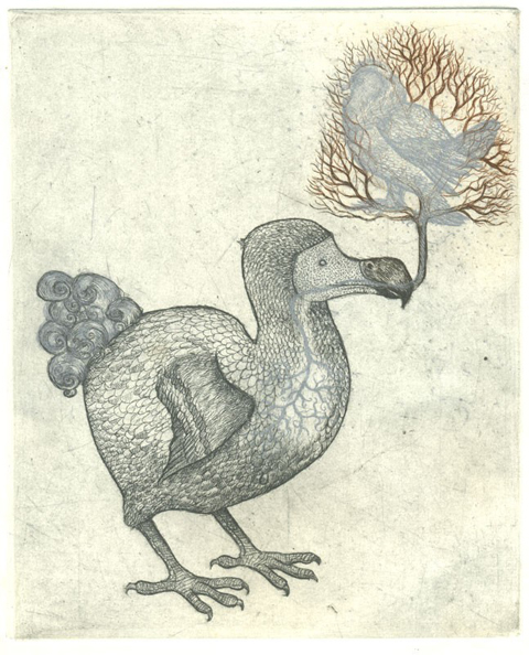
I've only been doing art/illustration full time for a bit over 2 years. Before that, it was on and off, and in between a lot of part time jobs. I try to be disciplined with my time, and surround myself with other creative people. Going into the Field Museum has been a great source of inspiration, with a great community of people. Earlier on my feelings about being an artist and illustrator were much more ambiguous, but now it's important to me because I feel like it is the best way that I engage with the world.
What is your process for making a concert poster?
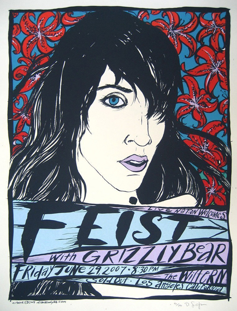
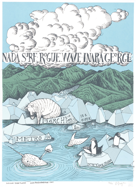
I won't make posters for music that I don't listen to (and thus am not familiar with), or in which I feel I am really out of synch with aesthetically. So yes, being somewhat immersed in the music of the band or individual that I am creating a poster for is very important. I will usually play their most current album repeatedly. I try to do a little research of the visual aesthetic of the band, and to see if there are themes from past show posters that I need to avoid because they have been overdone.
What music have you been into lately?
Bon Iver. I love the imagery in his songs, and am dying to make a poster. Other artists: Dodos, She and Him, Kid Sister, Fleet Foxes, Battles.
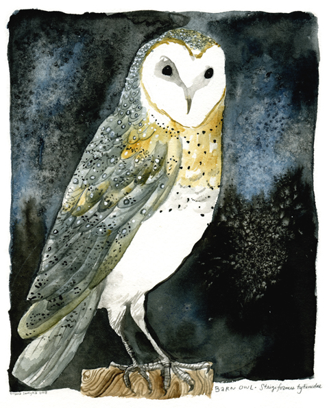 More of Diana's work can be viewed here: DianaSudyka.com. You can also check out her blog, The Tiny Aviary.
The deluxe package of Andrew Bird's latest album, 'Noble Beast', can be purchased here, containing a bonus instrumental disc along with a 24 page booklet of Diana Sudyka illustrations.
Mr. Bird plays SOMA in San Diego this Sunday, February 15th.